Owning Australian origin, and turning it into shelf impact
Before, Gold King leaned on traditional cues like navy, gold, and overly complex iconography to signal premium quality. The brand positioning said little and felt generic and outdated.
After our rebrand, Gold King moves in a different direction: a modern, confident identity that clearly represents Australian-grown avocados before a single word is said, commanding attention at the point of sale. With the Australian-grown claim holding strong relevance both locally and internationally, the brand is positioned for a standout growth.
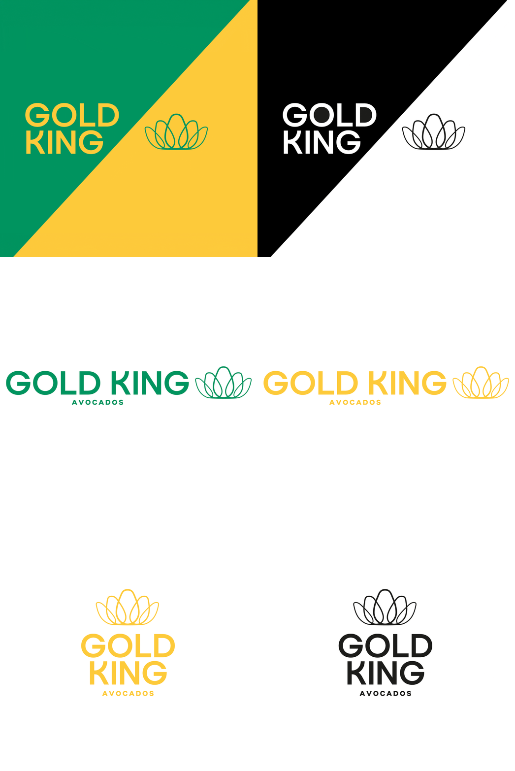
Our approach focused on making its quality and Australian origin unmistakable at the point of sale, using visual elements that consumers recognise instantly. The crown icon and colour palette were central to this shift, reinforcing both product quality and its origin.
Humanised illustrations on the side panels introduce warmth and authenticity, expressing a sense of pride in cooking with quality avocados.
The brand reposition also bring a new slogan “Crowned by Nature. Loved by Everyone”, present in a packaging to show how the product want be accepted and recognised.
The outcome delivers on what matters in FMCG: a brand that captures attention at the point of sale and connects with consumers.
If you’re planning a new FMCG launch or looking to reposition an existing product, Creative Pop partners with brands to create strategic branding and packaging that stands out at retail and performs in market.
Get in touch to talk about your next launch.